Our Name

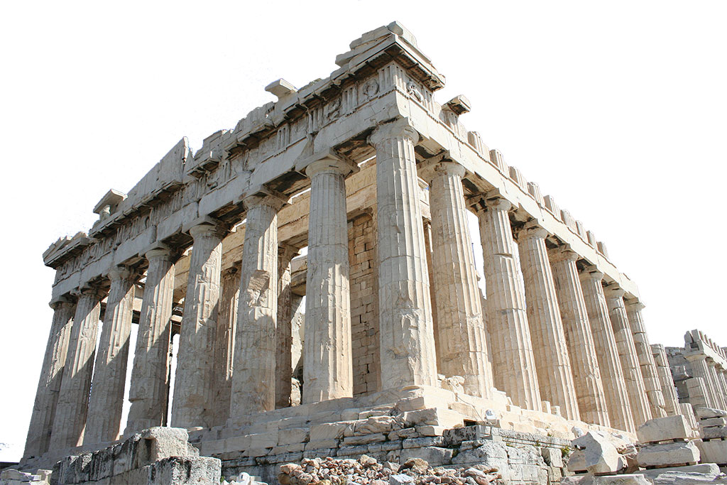
The city-state of Athens is widely regarded as the birthplace of democracy, and the Ancient Agora of Athens is considered the best example of the ancient Greek agora. In the Greek cities, those were the center of the city's artistic, political, and spiritual life. All citizens could gather there to hear their politicians and orators speak and discuss all aspects of city life. From this word comes the modern Greek ἀγορεύω - to give a speech, make a declamation.
Greece is also considered the birthplace of classical rhetoric - harboring the first schools that studied it and practiced it systematically. In fact, all modern-day public speaking practice can be traced back to these original schools.
Pronunciation
Agora is pronounced with an accent on the first A. The full phonetic notation is /ˈa-gə-rə /.
You can hear the pronunciation for example here: https://www.dictionary.com/browse/agora
What are we called?
Although there isn't an official term for "Agora members" other than... Agora members, many of our members like to call themselves "Agoreans". In this case, the accent would be on the "o" /a-'go-ri-əns /
Our Logo
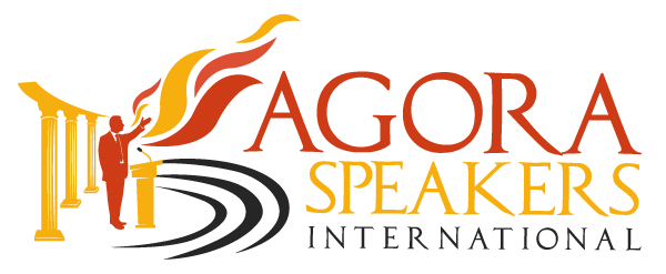
The logo pays homage to this heritage and represents everything we want for this organization. Open, democratic, passionate, and purposeful.

It is made up of four elements:
- Three Greek columns both representing our connection to the birthplace of democracy, the timeless principles we defend and believe in, and the solidity and stability of our organization
- A stylized representation of a Greek amphitheater symbolizing the audience and also the fact that leaders make waves that spread to the world.
- A speaker silhouette in a calm yet firm pose, with a wide-open arm gesture, represents leadership ideals - reaching out, dialogue, serenity, and conviction.
- The flames symbolize the passion and knowledge emanating from the speaker.